ShopDreamUp AI ArtDreamUp
Deviation Actions


![[ai adopt] cute opossum](https://images-wixmp-ed30a86b8c4ca887773594c2.wixmp.com/f/ddc18696-4f6c-45cb-9f33-d86c938029f4/dgrpy2j-633e5fb2-4af0-4894-82a0-a00bfc2b099a.jpg/v1/crop/w_184,h_184,x_0,y_0,scl_0.1796875,q_70,strp/_ai_adopt__cute_opossum_by_1dollaradopts_dgrpy2j-92s-2x.jpg?token=eyJ0eXAiOiJKV1QiLCJhbGciOiJIUzI1NiJ9.eyJzdWIiOiJ1cm46YXBwOjdlMGQxODg5ODIyNjQzNzNhNWYwZDQxNWVhMGQyNmUwIiwiaXNzIjoidXJuOmFwcDo3ZTBkMTg4OTgyMjY0MzczYTVmMGQ0MTVlYTBkMjZlMCIsIm9iaiI6W1t7ImhlaWdodCI6Ijw9MTAyNCIsInBhdGgiOiJcL2ZcL2RkYzE4Njk2LTRmNmMtNDVjYi05ZjMzLWQ4NmM5MzgwMjlmNFwvZGdycHkyai02MzNlNWZiMi00YWYwLTQ4OTQtODJhMC1hMDBiZmMyYjA5OWEuanBnIiwid2lkdGgiOiI8PTEwMjQifV1dLCJhdWQiOlsidXJuOnNlcnZpY2U6aW1hZ2Uub3BlcmF0aW9ucyJdfQ.9JZuoW8vMRzMOB7r4uX4zvvB4lh1hGFvtKGgvr8icDQ)
![[ai adopt] cute opossum](https://images-wixmp-ed30a86b8c4ca887773594c2.wixmp.com/f/ddc18696-4f6c-45cb-9f33-d86c938029f4/dgrpy2j-633e5fb2-4af0-4894-82a0-a00bfc2b099a.jpg/v1/crop/w_92,h_92,x_0,y_0,scl_0.08984375,q_70,strp/_ai_adopt__cute_opossum_by_1dollaradopts_dgrpy2j-92s.jpg?token=eyJ0eXAiOiJKV1QiLCJhbGciOiJIUzI1NiJ9.eyJzdWIiOiJ1cm46YXBwOjdlMGQxODg5ODIyNjQzNzNhNWYwZDQxNWVhMGQyNmUwIiwiaXNzIjoidXJuOmFwcDo3ZTBkMTg4OTgyMjY0MzczYTVmMGQ0MTVlYTBkMjZlMCIsIm9iaiI6W1t7ImhlaWdodCI6Ijw9MTAyNCIsInBhdGgiOiJcL2ZcL2RkYzE4Njk2LTRmNmMtNDVjYi05ZjMzLWQ4NmM5MzgwMjlmNFwvZGdycHkyai02MzNlNWZiMi00YWYwLTQ4OTQtODJhMC1hMDBiZmMyYjA5OWEuanBnIiwid2lkdGgiOiI8PTEwMjQifV1dLCJhdWQiOlsidXJuOnNlcnZpY2U6aW1hZ2Uub3BlcmF0aW9ucyJdfQ.9JZuoW8vMRzMOB7r4uX4zvvB4lh1hGFvtKGgvr8icDQ)
![[ai adopt] sand wolf](https://images-wixmp-ed30a86b8c4ca887773594c2.wixmp.com/f/ddc18696-4f6c-45cb-9f33-d86c938029f4/dgqiucm-9e9b94f3-fe8a-4b0d-aaa7-ce21bc22163b.jpg/v1/crop/w_184,h_184,x_0,y_0,scl_0.1796875,q_70,strp/_ai_adopt__sand_wolf_by_1dollaradopts_dgqiucm-92s-2x.jpg?token=eyJ0eXAiOiJKV1QiLCJhbGciOiJIUzI1NiJ9.eyJzdWIiOiJ1cm46YXBwOjdlMGQxODg5ODIyNjQzNzNhNWYwZDQxNWVhMGQyNmUwIiwiaXNzIjoidXJuOmFwcDo3ZTBkMTg4OTgyMjY0MzczYTVmMGQ0MTVlYTBkMjZlMCIsIm9iaiI6W1t7ImhlaWdodCI6Ijw9MTAyNCIsInBhdGgiOiJcL2ZcL2RkYzE4Njk2LTRmNmMtNDVjYi05ZjMzLWQ4NmM5MzgwMjlmNFwvZGdxaXVjbS05ZTliOTRmMy1mZThhLTRiMGQtYWFhNy1jZTIxYmMyMjE2M2IuanBnIiwid2lkdGgiOiI8PTEwMjQifV1dLCJhdWQiOlsidXJuOnNlcnZpY2U6aW1hZ2Uub3BlcmF0aW9ucyJdfQ.yfr2_f27i83Bo_YWduxFqpW18vNIcArUAKrYpKCbISU)
![[ai adopt] sand wolf](https://images-wixmp-ed30a86b8c4ca887773594c2.wixmp.com/f/ddc18696-4f6c-45cb-9f33-d86c938029f4/dgqiucm-9e9b94f3-fe8a-4b0d-aaa7-ce21bc22163b.jpg/v1/crop/w_92,h_92,x_0,y_0,scl_0.08984375,q_70,strp/_ai_adopt__sand_wolf_by_1dollaradopts_dgqiucm-92s.jpg?token=eyJ0eXAiOiJKV1QiLCJhbGciOiJIUzI1NiJ9.eyJzdWIiOiJ1cm46YXBwOjdlMGQxODg5ODIyNjQzNzNhNWYwZDQxNWVhMGQyNmUwIiwiaXNzIjoidXJuOmFwcDo3ZTBkMTg4OTgyMjY0MzczYTVmMGQ0MTVlYTBkMjZlMCIsIm9iaiI6W1t7ImhlaWdodCI6Ijw9MTAyNCIsInBhdGgiOiJcL2ZcL2RkYzE4Njk2LTRmNmMtNDVjYi05ZjMzLWQ4NmM5MzgwMjlmNFwvZGdxaXVjbS05ZTliOTRmMy1mZThhLTRiMGQtYWFhNy1jZTIxYmMyMjE2M2IuanBnIiwid2lkdGgiOiI8PTEwMjQifV1dLCJhdWQiOlsidXJuOnNlcnZpY2U6aW1hZ2Uub3BlcmF0aW9ucyJdfQ.yfr2_f27i83Bo_YWduxFqpW18vNIcArUAKrYpKCbISU)
![[ai adopt] nature fox](https://images-wixmp-ed30a86b8c4ca887773594c2.wixmp.com/f/ddc18696-4f6c-45cb-9f33-d86c938029f4/dgqk1jr-6aa66b3f-17b2-407e-a8ee-a5a10b459e4c.jpg/v1/crop/w_184,h_184,x_0,y_0,scl_0.1796875,q_70,strp/_ai_adopt__nature_fox_by_1dollaradopts_dgqk1jr-92s-2x.jpg?token=eyJ0eXAiOiJKV1QiLCJhbGciOiJIUzI1NiJ9.eyJzdWIiOiJ1cm46YXBwOjdlMGQxODg5ODIyNjQzNzNhNWYwZDQxNWVhMGQyNmUwIiwiaXNzIjoidXJuOmFwcDo3ZTBkMTg4OTgyMjY0MzczYTVmMGQ0MTVlYTBkMjZlMCIsIm9iaiI6W1t7ImhlaWdodCI6Ijw9MTAyNCIsInBhdGgiOiJcL2ZcL2RkYzE4Njk2LTRmNmMtNDVjYi05ZjMzLWQ4NmM5MzgwMjlmNFwvZGdxazFqci02YWE2NmIzZi0xN2IyLTQwN2UtYThlZS1hNWExMGI0NTllNGMuanBnIiwid2lkdGgiOiI8PTEwMjQifV1dLCJhdWQiOlsidXJuOnNlcnZpY2U6aW1hZ2Uub3BlcmF0aW9ucyJdfQ.8PohYM63wN4ortb0rt1-hK9LbEoVJD6Dfa5wpniUdKM)
![[ai adopt] nature fox](https://images-wixmp-ed30a86b8c4ca887773594c2.wixmp.com/f/ddc18696-4f6c-45cb-9f33-d86c938029f4/dgqk1jr-6aa66b3f-17b2-407e-a8ee-a5a10b459e4c.jpg/v1/crop/w_92,h_92,x_0,y_0,scl_0.08984375,q_70,strp/_ai_adopt__nature_fox_by_1dollaradopts_dgqk1jr-92s.jpg?token=eyJ0eXAiOiJKV1QiLCJhbGciOiJIUzI1NiJ9.eyJzdWIiOiJ1cm46YXBwOjdlMGQxODg5ODIyNjQzNzNhNWYwZDQxNWVhMGQyNmUwIiwiaXNzIjoidXJuOmFwcDo3ZTBkMTg4OTgyMjY0MzczYTVmMGQ0MTVlYTBkMjZlMCIsIm9iaiI6W1t7ImhlaWdodCI6Ijw9MTAyNCIsInBhdGgiOiJcL2ZcL2RkYzE4Njk2LTRmNmMtNDVjYi05ZjMzLWQ4NmM5MzgwMjlmNFwvZGdxazFqci02YWE2NmIzZi0xN2IyLTQwN2UtYThlZS1hNWExMGI0NTllNGMuanBnIiwid2lkdGgiOiI8PTEwMjQifV1dLCJhdWQiOlsidXJuOnNlcnZpY2U6aW1hZ2Uub3BlcmF0aW9ucyJdfQ.8PohYM63wN4ortb0rt1-hK9LbEoVJD6Dfa5wpniUdKM)
![[CLOSED] Adopt Series 1 - Cozy Set](https://images-wixmp-ed30a86b8c4ca887773594c2.wixmp.com/f/3eca2708-e5de-4905-a210-d627835a9491/dcuogav-4d4c2b48-2870-4d39-b5cf-4f18e0d0ba40.png/v1/crop/w_184,h_184,x_15,y_0,scl_0.12751212751213,q_70,strp/_closed__adopt_series_1___cozy_set_by_plushpon_dcuogav-92s-2x.jpg?token=eyJ0eXAiOiJKV1QiLCJhbGciOiJIUzI1NiJ9.eyJzdWIiOiJ1cm46YXBwOjdlMGQxODg5ODIyNjQzNzNhNWYwZDQxNWVhMGQyNmUwIiwiaXNzIjoidXJuOmFwcDo3ZTBkMTg4OTgyMjY0MzczYTVmMGQ0MTVlYTBkMjZlMCIsIm9iaiI6W1t7ImhlaWdodCI6Ijw9MTIwMyIsInBhdGgiOiJcL2ZcLzNlY2EyNzA4LWU1ZGUtNDkwNS1hMjEwLWQ2Mjc4MzVhOTQ5MVwvZGN1b2dhdi00ZDRjMmI0OC0yODcwLTRkMzktYjVjZi00ZjE4ZTBkMGJhNDAucG5nIiwid2lkdGgiOiI8PTE2MDAifV1dLCJhdWQiOlsidXJuOnNlcnZpY2U6aW1hZ2Uub3BlcmF0aW9ucyJdfQ.X1BXsBCf8290Adxsst1ICvvCMSHmrkOPU7AHz3v8YC0)
![[CLOSED] Adopt Series 1 - Cozy Set](https://images-wixmp-ed30a86b8c4ca887773594c2.wixmp.com/f/3eca2708-e5de-4905-a210-d627835a9491/dcuogav-4d4c2b48-2870-4d39-b5cf-4f18e0d0ba40.png/v1/crop/w_92,h_92,x_8,y_0,scl_0.063756063756064,q_70,strp/_closed__adopt_series_1___cozy_set_by_plushpon_dcuogav-92s.jpg?token=eyJ0eXAiOiJKV1QiLCJhbGciOiJIUzI1NiJ9.eyJzdWIiOiJ1cm46YXBwOjdlMGQxODg5ODIyNjQzNzNhNWYwZDQxNWVhMGQyNmUwIiwiaXNzIjoidXJuOmFwcDo3ZTBkMTg4OTgyMjY0MzczYTVmMGQ0MTVlYTBkMjZlMCIsIm9iaiI6W1t7ImhlaWdodCI6Ijw9MTIwMyIsInBhdGgiOiJcL2ZcLzNlY2EyNzA4LWU1ZGUtNDkwNS1hMjEwLWQ2Mjc4MzVhOTQ5MVwvZGN1b2dhdi00ZDRjMmI0OC0yODcwLTRkMzktYjVjZi00ZjE4ZTBkMGJhNDAucG5nIiwid2lkdGgiOiI8PTE2MDAifV1dLCJhdWQiOlsidXJuOnNlcnZpY2U6aW1hZ2Uub3BlcmF0aW9ucyJdfQ.X1BXsBCf8290Adxsst1ICvvCMSHmrkOPU7AHz3v8YC0)


![[CLOSED!] Adopt Series 1 - Plant Set [Auction]](https://images-wixmp-ed30a86b8c4ca887773594c2.wixmp.com/f/3eca2708-e5de-4905-a210-d627835a9491/dctp4qy-b8f00956-649f-49f5-aa93-593d413f8727.png/v1/crop/w_184,h_184,x_46,y_0,scl_0.19226750261233,q_70,strp/_closed___adopt_series_1____plant_set__auction__by_plushpon_dctp4qy-92s-2x.jpg?token=eyJ0eXAiOiJKV1QiLCJhbGciOiJIUzI1NiJ9.eyJzdWIiOiJ1cm46YXBwOjdlMGQxODg5ODIyNjQzNzNhNWYwZDQxNWVhMGQyNmUwIiwiaXNzIjoidXJuOmFwcDo3ZTBkMTg4OTgyMjY0MzczYTVmMGQ0MTVlYTBkMjZlMCIsIm9iaiI6W1t7ImhlaWdodCI6Ijw9Nzk4IiwicGF0aCI6IlwvZlwvM2VjYTI3MDgtZTVkZS00OTA1LWEyMTAtZDYyNzgzNWE5NDkxXC9kY3RwNHF5LWI4ZjAwOTU2LTY0OWYtNDlmNS1hYTkzLTU5M2Q0MTNmODcyNy5wbmciLCJ3aWR0aCI6Ijw9MTYwMCJ9XV0sImF1ZCI6WyJ1cm46c2VydmljZTppbWFnZS5vcGVyYXRpb25zIl19.iw0LO-jGfXMUQ5XvCFiddoH60n4AGMcSwLUiVHuRxcU)
![[CLOSED!] Adopt Series 1 - Plant Set [Auction]](https://images-wixmp-ed30a86b8c4ca887773594c2.wixmp.com/f/3eca2708-e5de-4905-a210-d627835a9491/dctp4qy-b8f00956-649f-49f5-aa93-593d413f8727.png/v1/crop/w_92,h_92,x_23,y_0,scl_0.096133751306165,q_70,strp/_closed___adopt_series_1____plant_set__auction__by_plushpon_dctp4qy-92s.jpg?token=eyJ0eXAiOiJKV1QiLCJhbGciOiJIUzI1NiJ9.eyJzdWIiOiJ1cm46YXBwOjdlMGQxODg5ODIyNjQzNzNhNWYwZDQxNWVhMGQyNmUwIiwiaXNzIjoidXJuOmFwcDo3ZTBkMTg4OTgyMjY0MzczYTVmMGQ0MTVlYTBkMjZlMCIsIm9iaiI6W1t7ImhlaWdodCI6Ijw9Nzk4IiwicGF0aCI6IlwvZlwvM2VjYTI3MDgtZTVkZS00OTA1LWEyMTAtZDYyNzgzNWE5NDkxXC9kY3RwNHF5LWI4ZjAwOTU2LTY0OWYtNDlmNS1hYTkzLTU5M2Q0MTNmODcyNy5wbmciLCJ3aWR0aCI6Ijw9MTYwMCJ9XV0sImF1ZCI6WyJ1cm46c2VydmljZTppbWFnZS5vcGVyYXRpb25zIl19.iw0LO-jGfXMUQ5XvCFiddoH60n4AGMcSwLUiVHuRxcU)


![ZOMBIE FERRET [CLOSED]](https://images-wixmp-ed30a86b8c4ca887773594c2.wixmp.com/f/91f5dc58-85d5-48f5-b030-6fd865699f0c/df9xkbr-73a6e91f-a575-4118-a450-7854e1ec3d8a.png/v1/crop/w_184,h_184,x_41,y_0,scl_0.17037037037037,q_70,strp/zombie_ferret__closed__by_x_teeth_x_df9xkbr-92s-2x.jpg?token=eyJ0eXAiOiJKV1QiLCJhbGciOiJIUzI1NiJ9.eyJzdWIiOiJ1cm46YXBwOjdlMGQxODg5ODIyNjQzNzNhNWYwZDQxNWVhMGQyNmUwIiwiaXNzIjoidXJuOmFwcDo3ZTBkMTg4OTgyMjY0MzczYTVmMGQ0MTVlYTBkMjZlMCIsIm9iaiI6W1t7ImhlaWdodCI6Ijw9Njc2IiwicGF0aCI6IlwvZlwvOTFmNWRjNTgtODVkNS00OGY1LWIwMzAtNmZkODY1Njk5ZjBjXC9kZjl4a2JyLTczYTZlOTFmLWE1NzUtNDExOC1hNDUwLTc4NTRlMWVjM2Q4YS5wbmciLCJ3aWR0aCI6Ijw9MTI4MCJ9XV0sImF1ZCI6WyJ1cm46c2VydmljZTppbWFnZS5vcGVyYXRpb25zIl19.o1i3-ewul37vkHvJ00gwrnI9WvtpHA6srCG0fP-Izps)
![ZOMBIE FERRET [CLOSED]](https://images-wixmp-ed30a86b8c4ca887773594c2.wixmp.com/f/91f5dc58-85d5-48f5-b030-6fd865699f0c/df9xkbr-73a6e91f-a575-4118-a450-7854e1ec3d8a.png/v1/crop/w_92,h_92,x_21,y_0,scl_0.085185185185185,q_70,strp/zombie_ferret__closed__by_x_teeth_x_df9xkbr-92s.jpg?token=eyJ0eXAiOiJKV1QiLCJhbGciOiJIUzI1NiJ9.eyJzdWIiOiJ1cm46YXBwOjdlMGQxODg5ODIyNjQzNzNhNWYwZDQxNWVhMGQyNmUwIiwiaXNzIjoidXJuOmFwcDo3ZTBkMTg4OTgyMjY0MzczYTVmMGQ0MTVlYTBkMjZlMCIsIm9iaiI6W1t7ImhlaWdodCI6Ijw9Njc2IiwicGF0aCI6IlwvZlwvOTFmNWRjNTgtODVkNS00OGY1LWIwMzAtNmZkODY1Njk5ZjBjXC9kZjl4a2JyLTczYTZlOTFmLWE1NzUtNDExOC1hNDUwLTc4NTRlMWVjM2Q4YS5wbmciLCJ3aWR0aCI6Ijw9MTI4MCJ9XV0sImF1ZCI6WyJ1cm46c2VydmljZTppbWFnZS5vcGVyYXRpb25zIl19.o1i3-ewul37vkHvJ00gwrnI9WvtpHA6srCG0fP-Izps)
![ADOPT AUCTION - The Gilded Cage [SOLD]](https://images-wixmp-ed30a86b8c4ca887773594c2.wixmp.com/f/1019d0fd-ccb5-4786-a42f-c8dcdcde0508/dfhsjlb-3d20a75e-fc2d-4116-912d-139294bb699b.png/v1/crop/w_184,h_184,x_30,y_0,scl_0.1602787456446,q_70,strp/adopt_auction___the_gilded_cage__sold__by_silent_mantra_dfhsjlb-92s-2x.jpg?token=eyJ0eXAiOiJKV1QiLCJhbGciOiJIUzI1NiJ9.eyJzdWIiOiJ1cm46YXBwOjdlMGQxODg5ODIyNjQzNzNhNWYwZDQxNWVhMGQyNmUwIiwiaXNzIjoidXJuOmFwcDo3ZTBkMTg4OTgyMjY0MzczYTVmMGQ0MTVlYTBkMjZlMCIsIm9iaiI6W1t7ImhlaWdodCI6Ijw9NTQ3IiwicGF0aCI6IlwvZlwvMTAxOWQwZmQtY2NiNS00Nzg2LWE0MmYtYzhkY2RjZGUwNTA4XC9kZmhzamxiLTNkMjBhNzVlLWZjMmQtNDExNi05MTJkLTEzOTI5NGJiNjk5Yi5wbmciLCJ3aWR0aCI6Ijw9OTAwIn1dXSwiYXVkIjpbInVybjpzZXJ2aWNlOmltYWdlLm9wZXJhdGlvbnMiXX0.1tynmDV3Z7dtWGXsnGmMH7C9taNGYi0v2UZzI9fcGnM)
![ADOPT AUCTION - The Gilded Cage [SOLD]](https://images-wixmp-ed30a86b8c4ca887773594c2.wixmp.com/f/1019d0fd-ccb5-4786-a42f-c8dcdcde0508/dfhsjlb-3d20a75e-fc2d-4116-912d-139294bb699b.png/v1/crop/w_92,h_92,x_15,y_0,scl_0.0801393728223,q_70,strp/adopt_auction___the_gilded_cage__sold__by_silent_mantra_dfhsjlb-92s.jpg?token=eyJ0eXAiOiJKV1QiLCJhbGciOiJIUzI1NiJ9.eyJzdWIiOiJ1cm46YXBwOjdlMGQxODg5ODIyNjQzNzNhNWYwZDQxNWVhMGQyNmUwIiwiaXNzIjoidXJuOmFwcDo3ZTBkMTg4OTgyMjY0MzczYTVmMGQ0MTVlYTBkMjZlMCIsIm9iaiI6W1t7ImhlaWdodCI6Ijw9NTQ3IiwicGF0aCI6IlwvZlwvMTAxOWQwZmQtY2NiNS00Nzg2LWE0MmYtYzhkY2RjZGUwNTA4XC9kZmhzamxiLTNkMjBhNzVlLWZjMmQtNDExNi05MTJkLTEzOTI5NGJiNjk5Yi5wbmciLCJ3aWR0aCI6Ijw9OTAwIn1dXSwiYXVkIjpbInVybjpzZXJ2aWNlOmltYWdlLm9wZXJhdGlvbnMiXX0.1tynmDV3Z7dtWGXsnGmMH7C9taNGYi0v2UZzI9fcGnM)
![[CLOSED] Adopt auction - PURSE](https://images-wixmp-ed30a86b8c4ca887773594c2.wixmp.com/f/8ba10e62-7f60-4769-a2af-ae1a076884a7/dg3r8ib-ed514567-a618-438e-b881-1c34cf062240.png/v1/crop/w_184,h_184,x_34,y_0,scl_0.061333333333333,q_70,strp/_closed__adopt_auction___purse_by_of711_dg3r8ib-92s-2x.jpg?token=eyJ0eXAiOiJKV1QiLCJhbGciOiJIUzI1NiJ9.eyJzdWIiOiJ1cm46YXBwOjdlMGQxODg5ODIyNjQzNzNhNWYwZDQxNWVhMGQyNmUwIiwiaXNzIjoidXJuOmFwcDo3ZTBkMTg4OTgyMjY0MzczYTVmMGQ0MTVlYTBkMjZlMCIsIm9iaiI6W1t7ImhlaWdodCI6Ijw9OTI0IiwicGF0aCI6IlwvZlwvOGJhMTBlNjItN2Y2MC00NzY5LWEyYWYtYWUxYTA3Njg4NGE3XC9kZzNyOGliLWVkNTE0NTY3LWE2MTgtNDM4ZS1iODgxLTFjMzRjZjA2MjI0MC5wbmciLCJ3aWR0aCI6Ijw9MTYwMCJ9XV0sImF1ZCI6WyJ1cm46c2VydmljZTppbWFnZS5vcGVyYXRpb25zIl19.1EP-dlassX_KXov8RAeXKdDLBNAjpwyVjKqM6Gc2BpM)
![[CLOSED] Adopt auction - PURSE](https://images-wixmp-ed30a86b8c4ca887773594c2.wixmp.com/f/8ba10e62-7f60-4769-a2af-ae1a076884a7/dg3r8ib-ed514567-a618-438e-b881-1c34cf062240.png/v1/crop/w_92,h_92,x_17,y_0,scl_0.030666666666667,q_70,strp/_closed__adopt_auction___purse_by_of711_dg3r8ib-92s.jpg?token=eyJ0eXAiOiJKV1QiLCJhbGciOiJIUzI1NiJ9.eyJzdWIiOiJ1cm46YXBwOjdlMGQxODg5ODIyNjQzNzNhNWYwZDQxNWVhMGQyNmUwIiwiaXNzIjoidXJuOmFwcDo3ZTBkMTg4OTgyMjY0MzczYTVmMGQ0MTVlYTBkMjZlMCIsIm9iaiI6W1t7ImhlaWdodCI6Ijw9OTI0IiwicGF0aCI6IlwvZlwvOGJhMTBlNjItN2Y2MC00NzY5LWEyYWYtYWUxYTA3Njg4NGE3XC9kZzNyOGliLWVkNTE0NTY3LWE2MTgtNDM4ZS1iODgxLTFjMzRjZjA2MjI0MC5wbmciLCJ3aWR0aCI6Ijw9MTYwMCJ9XV0sImF1ZCI6WyJ1cm46c2VydmljZTppbWFnZS5vcGVyYXRpb25zIl19.1EP-dlassX_KXov8RAeXKdDLBNAjpwyVjKqM6Gc2BpM)


![[CLOSED] OTA - Happy Halloween 2023!](https://images-wixmp-ed30a86b8c4ca887773594c2.wixmp.com/f/7b31ea0a-aa84-42d1-848c-1b8d40dae793/dgecguq-a2253661-9859-4736-8ab0-732fde415cf9.jpg/v1/crop/w_184,h_184,x_28,y_0,scl_0.052332195676906,q_70,strp/_closed__ota___happy_halloween_2023__by_whixy_dgecguq-92s-2x.jpg?token=eyJ0eXAiOiJKV1QiLCJhbGciOiJIUzI1NiJ9.eyJzdWIiOiJ1cm46YXBwOjdlMGQxODg5ODIyNjQzNzNhNWYwZDQxNWVhMGQyNmUwIiwiaXNzIjoidXJuOmFwcDo3ZTBkMTg4OTgyMjY0MzczYTVmMGQ0MTVlYTBkMjZlMCIsIm9iaiI6W1t7ImhlaWdodCI6Ijw9NjM4IiwicGF0aCI6IlwvZlwvN2IzMWVhMGEtYWE4NC00MmQxLTg0OGMtMWI4ZDQwZGFlNzkzXC9kZ2VjZ3VxLWEyMjUzNjYxLTk4NTktNDczNi04YWIwLTczMmZkZTQxNWNmOS5qcGciLCJ3aWR0aCI6Ijw9MTAyNCJ9XV0sImF1ZCI6WyJ1cm46c2VydmljZTppbWFnZS5vcGVyYXRpb25zIl19.Y5jgNqUnBynAwT4qKwAVbtdFORvZ3XnsPv2WwYBPEx8)
![[CLOSED] OTA - Happy Halloween 2023!](https://images-wixmp-ed30a86b8c4ca887773594c2.wixmp.com/f/7b31ea0a-aa84-42d1-848c-1b8d40dae793/dgecguq-a2253661-9859-4736-8ab0-732fde415cf9.jpg/v1/crop/w_92,h_92,x_14,y_0,scl_0.026166097838453,q_70,strp/_closed__ota___happy_halloween_2023__by_whixy_dgecguq-92s.jpg?token=eyJ0eXAiOiJKV1QiLCJhbGciOiJIUzI1NiJ9.eyJzdWIiOiJ1cm46YXBwOjdlMGQxODg5ODIyNjQzNzNhNWYwZDQxNWVhMGQyNmUwIiwiaXNzIjoidXJuOmFwcDo3ZTBkMTg4OTgyMjY0MzczYTVmMGQ0MTVlYTBkMjZlMCIsIm9iaiI6W1t7ImhlaWdodCI6Ijw9NjM4IiwicGF0aCI6IlwvZlwvN2IzMWVhMGEtYWE4NC00MmQxLTg0OGMtMWI4ZDQwZGFlNzkzXC9kZ2VjZ3VxLWEyMjUzNjYxLTk4NTktNDczNi04YWIwLTczMmZkZTQxNWNmOS5qcGciLCJ3aWR0aCI6Ijw9MTAyNCJ9XV0sImF1ZCI6WyJ1cm46c2VydmljZTppbWFnZS5vcGVyYXRpb25zIl19.Y5jgNqUnBynAwT4qKwAVbtdFORvZ3XnsPv2WwYBPEx8)
![[CLOSED] Mezereum animated adopt](https://images-wixmp-ed30a86b8c4ca887773594c2.wixmp.com/f/589bf480-f49d-4ff7-93ba-057a22620561/dent858-cde60ecc-bd4e-41db-912c-a3dbd20c8b94.gif/v1/crop/w_184,h_184,x_25,y_0,scl_0.31506849315068,q_85,strp/_closed__mezereum_animated_adopt_by_sherharon_dent858-92s-2x.jpg?token=eyJ0eXAiOiJKV1QiLCJhbGciOiJIUzI1NiJ9.eyJzdWIiOiJ1cm46YXBwOjdlMGQxODg5ODIyNjQzNzNhNWYwZDQxNWVhMGQyNmUwIiwiaXNzIjoidXJuOmFwcDo3ZTBkMTg4OTgyMjY0MzczYTVmMGQ0MTVlYTBkMjZlMCIsIm9iaiI6W1t7ImhlaWdodCI6Ijw9NTg0IiwicGF0aCI6IlwvZlwvNTg5YmY0ODAtZjQ5ZC00ZmY3LTkzYmEtMDU3YTIyNjIwNTYxXC9kZW50ODU4LWNkZTYwZWNjLWJkNGUtNDFkYi05MTJjLWEzZGJkMjBjOGI5NC5naWYiLCJ3aWR0aCI6Ijw9OTAwIn1dXSwiYXVkIjpbInVybjpzZXJ2aWNlOmltYWdlLm9wZXJhdGlvbnMiXX0.OBfR8kyQY10LlI2dN0JxLz7G_TsWDohkeK-Aks2kjGg)
![[CLOSED] Mezereum animated adopt](https://images-wixmp-ed30a86b8c4ca887773594c2.wixmp.com/f/589bf480-f49d-4ff7-93ba-057a22620561/dent858-cde60ecc-bd4e-41db-912c-a3dbd20c8b94.gif/v1/crop/w_92,h_92,x_12,y_0,scl_0.15753424657534,q_85,strp/_closed__mezereum_animated_adopt_by_sherharon_dent858-92s.jpg?token=eyJ0eXAiOiJKV1QiLCJhbGciOiJIUzI1NiJ9.eyJzdWIiOiJ1cm46YXBwOjdlMGQxODg5ODIyNjQzNzNhNWYwZDQxNWVhMGQyNmUwIiwiaXNzIjoidXJuOmFwcDo3ZTBkMTg4OTgyMjY0MzczYTVmMGQ0MTVlYTBkMjZlMCIsIm9iaiI6W1t7ImhlaWdodCI6Ijw9NTg0IiwicGF0aCI6IlwvZlwvNTg5YmY0ODAtZjQ5ZC00ZmY3LTkzYmEtMDU3YTIyNjIwNTYxXC9kZW50ODU4LWNkZTYwZWNjLWJkNGUtNDFkYi05MTJjLWEzZGJkMjBjOGI5NC5naWYiLCJ3aWR0aCI6Ijw9OTAwIn1dXSwiYXVkIjpbInVybjpzZXJ2aWNlOmltYWdlLm9wZXJhdGlvbnMiXX0.OBfR8kyQY10LlI2dN0JxLz7G_TsWDohkeK-Aks2kjGg)
![Siridia -[ CLOSED ]](https://images-wixmp-ed30a86b8c4ca887773594c2.wixmp.com/f/60247094-c3ff-4800-9b14-1e092d45ac2d/ddzsbn8-b7f25bb7-b805-4705-87ce-c3f38296d369.png/v1/crop/w_184,h_184,x_28,y_0,scl_0.25555555555556/siridia____closed___by_torntethers_ddzsbn8-92s-2x.png?token=eyJ0eXAiOiJKV1QiLCJhbGciOiJIUzI1NiJ9.eyJzdWIiOiJ1cm46YXBwOjdlMGQxODg5ODIyNjQzNzNhNWYwZDQxNWVhMGQyNmUwIiwiaXNzIjoidXJuOmFwcDo3ZTBkMTg4OTgyMjY0MzczYTVmMGQ0MTVlYTBkMjZlMCIsIm9iaiI6W1t7ImhlaWdodCI6Ijw9NzIwIiwicGF0aCI6IlwvZlwvNjAyNDcwOTQtYzNmZi00ODAwLTliMTQtMWUwOTJkNDVhYzJkXC9kZHpzYm44LWI3ZjI1YmI3LWI4MDUtNDcwNS04N2NlLWMzZjM4Mjk2ZDM2OS5wbmciLCJ3aWR0aCI6Ijw9MTE1OSJ9XV0sImF1ZCI6WyJ1cm46c2VydmljZTppbWFnZS5vcGVyYXRpb25zIl19.0Ru0OGDlc2oC0XSzTv51HbgBt69VBsvFDj2lyBrGAiU)
![Siridia -[ CLOSED ]](https://images-wixmp-ed30a86b8c4ca887773594c2.wixmp.com/f/60247094-c3ff-4800-9b14-1e092d45ac2d/ddzsbn8-b7f25bb7-b805-4705-87ce-c3f38296d369.png/v1/crop/w_92,h_92,x_14,y_0,scl_0.12777777777778/siridia____closed___by_torntethers_ddzsbn8-92s.png?token=eyJ0eXAiOiJKV1QiLCJhbGciOiJIUzI1NiJ9.eyJzdWIiOiJ1cm46YXBwOjdlMGQxODg5ODIyNjQzNzNhNWYwZDQxNWVhMGQyNmUwIiwiaXNzIjoidXJuOmFwcDo3ZTBkMTg4OTgyMjY0MzczYTVmMGQ0MTVlYTBkMjZlMCIsIm9iaiI6W1t7ImhlaWdodCI6Ijw9NzIwIiwicGF0aCI6IlwvZlwvNjAyNDcwOTQtYzNmZi00ODAwLTliMTQtMWUwOTJkNDVhYzJkXC9kZHpzYm44LWI3ZjI1YmI3LWI4MDUtNDcwNS04N2NlLWMzZjM4Mjk2ZDM2OS5wbmciLCJ3aWR0aCI6Ijw9MTE1OSJ9XV0sImF1ZCI6WyJ1cm46c2VydmljZTppbWFnZS5vcGVyYXRpb25zIl19.0Ru0OGDlc2oC0XSzTv51HbgBt69VBsvFDj2lyBrGAiU)


![[CLOSED] Halloween Dragon Auction](https://images-wixmp-ed30a86b8c4ca887773594c2.wixmp.com/f/c3d22e93-3c53-4ea0-8686-04d00df8fcb9/detbm6n-fb7ecc69-8dd3-463e-9fa0-5da025e4f203.jpg/v1/crop/w_184,h_184,x_34,y_0,scl_0.064606741573034,q_70,strp/_closed__halloween_dragon_auction_by_montesmith_detbm6n-92s-2x.jpg?token=eyJ0eXAiOiJKV1QiLCJhbGciOiJIUzI1NiJ9.eyJzdWIiOiJ1cm46YXBwOjdlMGQxODg5ODIyNjQzNzNhNWYwZDQxNWVhMGQyNmUwIiwiaXNzIjoidXJuOmFwcDo3ZTBkMTg4OTgyMjY0MzczYTVmMGQ0MTVlYTBkMjZlMCIsIm9iaiI6W1t7ImhlaWdodCI6Ijw9NzM2IiwicGF0aCI6IlwvZlwvYzNkMjJlOTMtM2M1My00ZWEwLTg2ODYtMDRkMDBkZjhmY2I5XC9kZXRibTZuLWZiN2VjYzY5LThkZDMtNDYzZS05ZmEwLTVkYTAyNWU0ZjIwMy5qcGciLCJ3aWR0aCI6Ijw9MTI4MCJ9XV0sImF1ZCI6WyJ1cm46c2VydmljZTppbWFnZS5vcGVyYXRpb25zIl19.naf2OPxpFlhFq3yBlpXPWej6_Yc1BnLg0VJQRIZq5NQ)
![[CLOSED] Halloween Dragon Auction](https://images-wixmp-ed30a86b8c4ca887773594c2.wixmp.com/f/c3d22e93-3c53-4ea0-8686-04d00df8fcb9/detbm6n-fb7ecc69-8dd3-463e-9fa0-5da025e4f203.jpg/v1/crop/w_92,h_92,x_17,y_0,scl_0.032303370786517,q_70,strp/_closed__halloween_dragon_auction_by_montesmith_detbm6n-92s.jpg?token=eyJ0eXAiOiJKV1QiLCJhbGciOiJIUzI1NiJ9.eyJzdWIiOiJ1cm46YXBwOjdlMGQxODg5ODIyNjQzNzNhNWYwZDQxNWVhMGQyNmUwIiwiaXNzIjoidXJuOmFwcDo3ZTBkMTg4OTgyMjY0MzczYTVmMGQ0MTVlYTBkMjZlMCIsIm9iaiI6W1t7ImhlaWdodCI6Ijw9NzM2IiwicGF0aCI6IlwvZlwvYzNkMjJlOTMtM2M1My00ZWEwLTg2ODYtMDRkMDBkZjhmY2I5XC9kZXRibTZuLWZiN2VjYzY5LThkZDMtNDYzZS05ZmEwLTVkYTAyNWU0ZjIwMy5qcGciLCJ3aWR0aCI6Ijw9MTI4MCJ9XV0sImF1ZCI6WyJ1cm46c2VydmljZTppbWFnZS5vcGVyYXRpb25zIl19.naf2OPxpFlhFq3yBlpXPWej6_Yc1BnLg0VJQRIZq5NQ)
Description
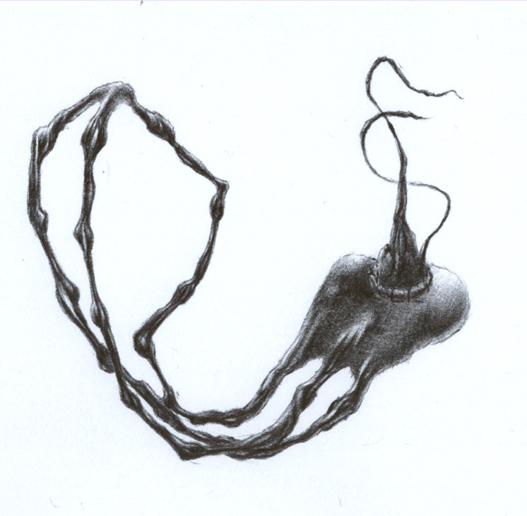
So. Mit dem Titel hab ich mir diesmal besonders viel Mühe gegeben. Ich denke mal er passt. Wie man sieht hab ich mir dabei natürlich was gedacht, der Bezug ist wohl klar erkennbar.
Das hat...lang gedauert...wie lang weiß ich nicht. Egal...jedenfalls lang. Und hat Nerven gekostet. Vorallem der Abschluss. Mir ist erst kein guter Abschluss eingefallen für diese Gliedmaßendinger. Wie man sieht hab ich mich letztendlich dann für einen ziemlich einfachen Abschluss entschieden, bei dem ich nicht allzu viel falsch machen konnte. Ist wohl auch besser so. Passiert zu oft das ich irgendwas bei meinen Zeichnungen falsch mache. Ob man das wohl sieht? Also...so als Betrachter? Vielleicht...nicht unbedingt, aber wenn man genau hinsieht...möglicherweise.
Mir ist grad nach deutschem Kommentar. Ich denke mal eine Übersetzung wird noch folgen. Ja. Bin mir ziemlich sicher. Man will ja niemanden benachteiligen, nicht? Denke nicht.
Sooo....was gibts noch zu erwähnen....tja, wie man sieht ist die Schattierung diesmal wirklich recht anders ausgefallen. Bin auch soweit zufrieden damit. Schöne Kontraste. Ganz gut so.
Danke für's Lesen. Jetz verschwinde. Oder hinterlass einen Kommentar. Ja. Mach das.
Update: English Translation of the above comment:
This time i've put much effort in choosing a title. I think it fits quite well. The relation to the picture and the motive are obvious.
It took...much time...not sure how much exactly though. However. And it was a pain in the neck, especially to find a good end for those limb-thingys. As you can see i've chosen quite a simple one to prevent myself from doing any bigger flaws yet. It's surely best that way, thinking about how often i've done flaws in my drawings. I wonder if those are always so obvious to the viewer...or only to me, as i know the original concept. Probably...may be not...however.
Bla bla (no need to be translated as i was just talking about that i'm in the mood for a german comment, but an english one would follow that's all).
Soo...what else do i have to mention...well, as you can see the shading looks kind of unusual this time. I'm quite proud of these rather extreme contrasts.
That's all.
Image size
746x730px 94.52 KB
© 2007 - 2024 TheGreatMe
Comments25
Join the community to add your comment. Already a deviant? Log In
I really must observe your artwork more closely in the future, now that you've gotten so incredibly detailed. Those tendons under the flesh are flawless, and the open flesh is cleverly done. You're in the big league now, congradulations my friend!
Excellent, truly excellent! May your pencil always remain sharp, and your wrists arthritis'less (not an actual word") ).
).
Excellent, truly excellent! May your pencil always remain sharp, and your wrists arthritis'less (not an actual word